Many websites look good but fail to convert visitors into customers due to poor UI/UX, slow performance, and lack of strategy.
This project focused on solving these problems with a structured and performance-driven approach.
Solution
A Complete Website Strategy Built for Performance
We created a website that combines:
Premium UI/UX design
Fast and responsive frontend
Conversion-focused layout
SEO-ready structure
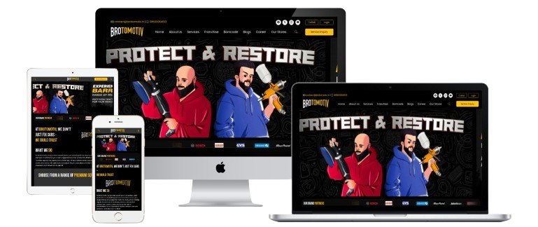
Brotomotiv’s website was developed from scratch with a focus on creating a premium, high-performance, and conversion-driven digital experience. The goal was to build a platform that reflects the brand’s luxury positioning while ensuring smooth user interaction and strong lead generation.
The entire approach was based on user experience, frontend performance, and structured content, making the website both visually appealing and functionally powerful.
UI/UX Design Strategy
The design was crafted to deliver a clean, modern, and intuitive interface that aligns with the automotive detailing industry.
A user-first approach was followed to ensure visitors can easily explore services, understand offerings, and take action without confusion.
The layout was designed using a structured grid system with proper alignment, spacing, and visual balance. Each section is clearly defined, helping users navigate smoothly across the website.
The navigation is simple and accessible, supported by a sticky header and well-organized menu, ensuring users can move between sections effortlessly.
Color Palette & Visual Identity
The color palette plays a crucial role in establishing brand perception.
The website uses a combination of:
Dark tones (black and grey) to create a premium and luxurious feel
Red for call-to-action elements to drive user action
Yellow for highlighting important elements and grabbing attention
White for maintaining clarity and readability
This combination ensures a strong visual hierarchy while keeping the interface clean and engaging.
Typography & Design Consistency
Typography was selected to enhance readability and maintain consistency across the website.
Clear font hierarchy ensures that headings stand out, while body text remains easy to read. Proper spacing between text elements improves scanning and user comfort.
Consistency in fonts, colors, and spacing creates a professional and polished appearance.
Interactions, Animations & Hover Effects
To make the website more engaging, subtle animations and interactive elements were implemented.
Smooth scroll animations help guide the user’s attention, while section-based transitions create a modern browsing experience.
Hover effects on buttons, images, and cards add interactivity and provide visual feedback, improving overall usability and engagement.
Content Placement & Structure
Content was strategically organized to guide users towards taking action.
Important sections are positioned prominently, ensuring users can quickly access key information. Services are clearly highlighted, and call-to-action elements are placed at critical points to encourage inquiries.
A balanced mix of visuals and content ensures users stay engaged without feeling overwhelmed.
Frontend Development
The frontend was built to deliver a seamless experience across all devices.
The website is fully responsive, ensuring it works smoothly on desktops, tablets, and mobile devices. The structure is optimized to provide fast loading and smooth transitions.
Special attention was given to maintaining a clean and scalable code structure, ensuring long-term performance and maintainability.
Backend & Functionality
The backend supports all essential functionalities required for smooth operation.
It includes systems for managing content, handling inquiries, and collecting lead data. Forms are designed to be simple and user-friendly, ensuring higher submission rates.
The system is also structured in a way that allows easy updates and management from the admin side.
Store Location Mapping
A key feature of the website is the implementation of a complete store locator system.
Users can easily find store locations through an integrated map, with locations organized by state and city. Each store listing includes detailed information such as address and contact details.
This feature enhances user convenience and also strengthens local visibility.
Mobile Responsive Design
The website is designed with a mobile-first approach to ensure optimal performance on smaller screens.
All elements are optimized for touch interaction, and the layout adapts seamlessly to different screen sizes. This ensures a consistent experience across all devices.
SEO Optimization
Basic on-page SEO practices were implemented to improve search visibility.
The website follows a proper content structure, uses relevant keywords, and includes optimized images with ALT tags. This helps search engines understand and index the content effectively.
Project Summary & Impact
A strategic transformation focused on design, performance, and lead generation
Area
Implementation
Impact
UI/UX Design
Premium structured layout
Better user experience
Color Strategy
Dark theme with red & yellow highlights
Strong brand identity
Frontend
Responsive & fast performance
Improved user engagement
Functionality
Integrated forms & Google mapping
Higher lead generation
SEO
On-page optimization
Better search visibility
Frequently Asked Questions
UI/UX design, website development, frontend implementation, and SEO structuring were included.
Yes, the website is fully responsive and optimized for all devices.
A well-designed UI/UX improves user engagement, reduces bounce rates, and increases conversions.
Yes, it includes a complete store locator with state, city, address, and contact details.
Yes, the website follows essential on-page SEO practices for better ranking.
Final Conclusion
This project highlights how a well-planned combination of UI/UX design, frontend development, and functional features can create a website that not only looks premium but also performs effectively.
The result is a digital platform that supports business growth, enhances user experience, and strengthens brand presence.
Want to Build a High-Performance Website Like This?
Let’s create a powerful digital experience for your business.